A big thank you to all our clients and visitors for year 2014.
Our technical capabilities and consultancy (LED lighting and manufacturing) has grown much stronger with your support. Light is just a bright source. Light fixtures will complement your ideal home/office. Together all 3 elements should flow to create your desire FEEL.
The recognition of our ELEKTRA™ and DUNAMIS™ brands for LED downlights and LED tube series are also getting more international calls. This is through quality, durability and strong after sales support. But, we aim to share more information with our supporters!
Our latest development: A special monthly edition of interior design homes. We will select a specific colour theme for each month and January 2015 will start with ORANGE.
Bright mandarin orange colour is bold, jubilant and inspires positive energy. With natural sunlight and suitable LED or artificial lighting, the bright orange will give occupants a lively atmosphere.


References:
1. http://www.decorating-design.com/modern-kitchen/top-5-orange-kitchens-fresh-and-odd-2697.html
2. www.decosee.com
3. http://www.home-designing.com/2012/06/spacious-modern-living-trends
Disclaimer: We are merely sharing some nice ideas seen online and do not claim ownership of the design and pictures.
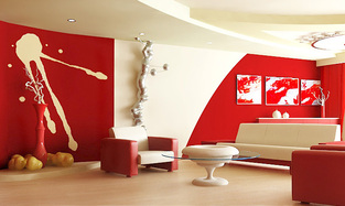
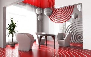
IASPL top 5 picks for FEB 15 (RED theme)
With the upcoming Happy Chinese New Year, we bring forth a series of red theme homes for your reference.
1. Most people have cove or false ceiling. Paint just your pop out area or wall red and you will instantly get a different feel.
2. Achieving a good vibrant feel for your place is easy. One can just get some bright red carpet and furniture. Your living room commodities may just all fall in place.
3. Besides designing the walls or ceilings, let us try putting designs on the floor and let your surrounding revolve around your floor! You will surely get a fresh perspective.
4. For the exciting and niche driven beings, try adding some simple splash art on your wall with 3D pop up impression. The 3D pop up can be your REAL lights, thus saving space and giving a visual treat.
5. Pragmatically, red camouflages slight dirtiness if its on the surface. Your brain will be less naggy in making you keep the place clean. Consider getting gloss laminate cabinets. They are easy to maintain, sharp crisp impression, its' reflection enhances the vibe and spaciousness of the environment.

|
|
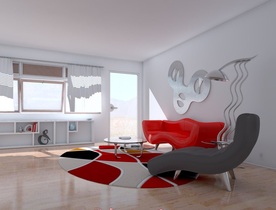
Red generally goes well with gold, white and black to create a modern feel. Here, i'm referring to the bright crimson red!
Where you can have that splash of red;
1. Carpet
2. Curtain
3. Wall Paper
4. Furniture
5. Light fixtures
6. Choosing proper LED lighting that brings out the red!
References;
http://www.google.com.sg/imgres?imgurl=http://www.idesignarch.com/wp-content/uploads/LivingRoomRed_1.jpg&imgrefurl=http://www.idesignarch.com/red-living-room-design-ideas/&h=453&w=760&tbnid=QwXPdlEbhUtZIM:&zoom=1&docid=NlzdgUSHG-q1sM&ei=WAnTVM3lA4Pc8AX74oCAAQ&tbm=isch&ved=0CCkQMygPMA8
http://www.google.com.sg/imgres?imgurl=http://www.homeconceptor.com/wp-content/uploads/2012/06/red-and-brown-living-room-ideas.jpg&imgrefurl=http://www.homeconceptor.com/red-and-brown-living-room-for-comfortable-living-room.html&h=363&w=582&tbnid=NwHMhd6AybPttM:&zoom=1&docid=gsA2IVPxhf9j7M&ei=WAnTVM3lA4Pc8AX74oCAAQ&tbm=isch&ved=0CDwQMygXMBc
http://www.google.com.sg/imgres?imgurl=http://4.bp.blogspot.com/-15MdFLYo8Tw/Ue4i6TP5PmI/AAAAAAAAB1E/vnAe9EcOnag/s1600/living-room-interior-design-with-modern-furniture-and-living-room-interior-design-with-red-decoration.jpg&imgrefurl=http://living-room-design1.blogspot.com/2013/07/living-room-interior-design-with-modern.html&h=780&w=1024&tbnid=B35ib-56QubIjM:&zoom=1&docid=rSLOu_pBl4UPXM&ei=SA3TVLG4IITo8gWHnILQAQ&tbm=isch&ved=0CBoQMygSMBI4ZA
http://www.google.com.sg/imgres?imgurl=http://www.iseecubed.com/wp-content/uploads/red-white-surprisingly-sharp-living-room-ideas-graphy.jpg&imgrefurl=http://www.iseecubed.com/impressive-fresh-black-white-living-room-decor/&h=901&w=600&tbnid=SX5WdCKovEWA5M:&zoom=1&docid=THTMA1qcP4vkYM&ei=NQ7TVJTtCpfe8AWG1YK4BA&tbm=isch&ved=0CEsQMyhDMEM49AM
http://www.snuut.com/images/2014/07/living-room-designs-nice-living-room-decoration-with-red-and-white-combination-wall-colour-white-comfort-sofa-brown-wooden-table-in-front-of-it-and-brown-wooden-floor-covered-white-rug-cool-living-800x539.jpeg
Disclaimer: Please note that the above pictures and designs are not owned by IASPL nor did we build them. We are merely sharing some ideas we saw online which we like and is not paid to publish them. IASPL should not be liable for any matters pertaining to the use of the information.
Purple used to be the colour reserved for only the Roman emperor and the Gods. These days it is associated closely to a manhattan theme interior decor.
By revolving around simplicity, easy for anyone to re-create, easy for maintenance, we shortlisted the following ideas below;
1. Purple furniture is simple direct and easy to create a change instantly
2. Having a feature wall in purple requires selecting suitable designs and knowing the colours and furnitures of the environment.
3. It is not necessary to always have solid colour base. Look at picture 4 where purple is used to create a floating sensation on the wall. Adding colours to your surfaces often gives a liberating feeling to the home owners.
Let us see how this royal and intriguing colour can add a touch of class to your home.


Benefits of using royal purple for walls;
1. Elegant and sophisticated sense of taste.
2. Allow art pieces / paintings to blend in nicely with the wall.
3. Goes well with gold, white, black and grey. Although we usually recommend bolder colours contrast for a refreshing vibe. E.g. we can have bright yellow beside the purple. You will be amaze how uniquely it fits in!
4. Easy maintenance since you won't really see much dirt on the dark purple base.
Disclaimer: At no times we claim ownership of the above photos and the works. We are only sharing what we found online and materials through our work as a lighting consultant and is not paid nor receive any incentives directly from the people producing the works above.
References
1. http://www.solarnovo.com/
2. http://housebeauty.net/
3. http://hugeinterior.com/?p=3986
4. http://dehouss.com/purple-kitchens/
IASPL top 5 picks for Apr 15 (Green theme)
Today, allow IASPL to present our top 5 picks of a GREEN coloured home in the literal sense!
Green sections in a home usually makes the place seem more naturalistic and giving a 'GREAT OUTDOORS' vibe. Together with a small water fountain and soothing classical music; I'm sure it eliminates the stress from a hectic city life. Having green colours at home to look at might also be a good thing for our tired eyes.
The conventional way of having a green theme are about painting, adding fabrics, wall papers, furnitures etc. These days we can do up a green wall system easily. Apart from real plants, using realistic but artificial vegetation will save you time and cost in maintenance. Mix and match the right combination of plants and you will not discount on the 'GREAT OUTDOORS' feel factor.
Even a small apartment can have a mini green area. Common areas to consider;
1. Along the walkway or aisle to your rooms
2. Near the entrance to your front door;
3. Around your TV console
4. Out at your balcony
You can assess the different types of wall mounted vegetation to the different texture carpet grass according to your preference. The artificial plants are guaranteed to be a simple hook up exercise. You can even do a special painting on your wall to complement the vegetation. This adds a layering effect to your wall. With a painting beneath the vegetation, you can anytime alternate the concept of your home by removing the vegetation. This will surprise your regular visitors!
Green goes well with many colours, most of all white, yellow, light purple, oak brown and light baby blue. In terms of pairing it with lighting, this really depends on the shade of green you have. It will give a good vibe with natural sunlight ranging from colour temperature of 4800K - 5800K.
For simplicity, one can use lighting and different types of plants for contrasting purposes. Do note that uniformity in the shade of green over a large area might just make your place look too commercial.
At Illuminating Asia, we are experimenting with various green wall in our showroom these days to find the most cost effective and simplest set up method for everyone's dream home. Do let us know beforehand if you wish to visit. No worries, no fees or cost involve. We love to share what we know!


References:
1. http://www.naturallivingmag.com/paint-ideas-interior-design-and-color-decoration-picture/green-stripes-wall-color-in-cool-bedroom-design-with-natural-plants/
2. http://www.interiordesigninhome.com/
3. http://biddecor.blogspot.sg/2015/03/modern-green-wall-decoration.html
4. https://www.pinterest.com/pin/432838214158806117/
5. https://www.pinterest.com/pin/432838214158806142
Disclaimer: We are merely sharing some nice ideas seen online and do not claim ownership of the design and pictures.
IASPL top 5 picks for May 15 (Yellow theme)
After a long day at work, sometimes we require subtle things to perk us up. Bright yellow in our home is surely the colour that may invigorate a tired soul. ON top of the energy it possesses, the colour does provide a sense of security and stableness. The right tone of yellow will further add a touch of class.
Will the colour be too loud? Probably not as it blends in well with natural sunlight or white lightings or white washed walls.
Yellow goes well with colours like; magenta, sky blue, brown, green, orange, white and even black.
It is one colour that can blend into furniture and wood panelling without much effort.
Most people would prefer to use warm white lighting to create a soothing environment at home. The warm white light bouncing off the wall will create a superbly relaxing environment that is truly warming.
If you have any ideas or experience with a bright yellow concept home, feel free to share with us!
Disclaimer: Note that we are merely sharing some designs that we have came across being simple and fitting of our publication theme. We do not receive any direct incentives for such sharing of information.
References:
trials-and-crenulations.blogspot.com
nickclaesdesigns.blogspot.com
dreamfunhouse.com
www.lushome.com
bodyklense.net


IASPL top 5 picks for JUL 15 (Gold theme)
Hi all, our sincere apologies for skipping the June 2015 edition. Now, we are back with the latest July 2015 edition on the GOLD Theme.
Using gold in interior design is never just about being exquisite. From ancient architectures to modern trinkets, gold is always an element and colour that gives a sense of strength to objects. Moving beyond the cliche idea of power and nobility, gold colour gives a sense of stability to an environment.
In lighting, correlated colour temperature ('CCT') of 2200 - 2500K provides the closest match to gold lighting colour. Remember how you have stepped in to TWG tea shops and feel the golden aura? Thats the colour.
Note that this lighting colour is within the warm lighting. Some people also refer this easily as warm white catagory. As such this often creates a confusion when people talk about warm white lighting colour tone.
Here we look at a few ideas of having gold colour in homes! You might be astound that gold colour can actually help soothe a hectic day. At least for me, gold has an ability to take my mind away from work. It might be same for you. Enjoy the pictures!
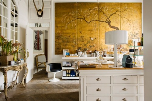
Having a wall mural with golden yellow background adds grandiose and firmness to an environment

A simple ornament from Chatuchak @ Bangkok. Hang it to your walkway from the door and you get a good ambience.
|
Our personal favourite. Simple golden mosaic for your kitchen wall. A cheap simple method that camouflage dirt well.
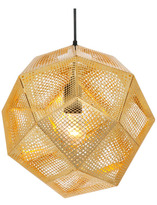
An easy to get golden pendant light. It might seem crude until you hang it center of your living room and see how well it blends in with the environment. We experience the same thoughts too.
|
One is able to have pendant lights with gold interior finish. You might gaze into it longer than you expect.
|
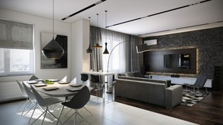
IASPL top 5 picks for Aug 15 (Grey theme)
Grey - a very standard colour used widely in homes around Singapore. Many people often pair it with black, white or a different tone of grey. How can we make grey more exciting?
Some low cost / free ideas we will consider personally;
1. Concentrate your grey colour on a design (e.g. a tree, a wall mural or art) instead on cabinets.
2. Shade your grey gradually from light to dark tone.
3. Using coloured lighting fixtures and warm lighting to balance the cold / stony feel of the grey.
4. Put your grey colour on the flooring rather than wall, ceiling or cabinets!
Today we showcase some modern contemporary usage of grey in homes to feel alive. Our aim is to inject vibrancy and energy to homes.


Disclaimer: We do not claim ownership of the above design and creation. We are merely sharing what we come across as slightly more interesting design for grey based interior design.
Reference:
www.decorcology.com
http://www.stratastones.net/image/Grey-Mosaic-Pebble-Tile-Bathroom-Wall.html
http://www.architonic.com/
http://www.interiorbyte.com/
Reference:
www.decorcology.com
http://www.stratastones.net/image/Grey-Mosaic-Pebble-Tile-Bathroom-Wall.html
http://www.architonic.com/
http://www.interiorbyte.com/
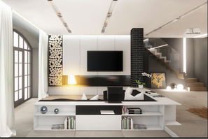
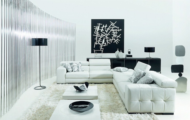
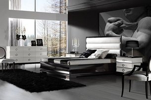
IASPL top 5 picks for Oct 15 (Black and White theme)
After our August 2015 theme, we decided to combine Sept and Oct 2015 together; with the 2 most common colours used for their homes; Black and White theme. These classic colour combination makes any room — from living room to bedrooms — sophisticated, chic, and timeless.
In our own opinion, there are some things to note for a black/white theme;
1. The place will probably feel darker even in the day. It might also create a serious or uptight emotions unknowingly. As such having a good window or natural light exposure will be a good balance to a black/white theme.
2. Unsure how much black or white is sufficient in a living space? Start by giving a quantifiable percentage on the proportion of black and white in a room. This will help narrow down your options. Say, i want 30% black in a room otherwise it might seem too scary at night. That means the walls are probably not going to be black. Instead the black can come from a rug, your TV screen and the aesthetic lightings.
3. Remember that shadows are a different tone of black. Without proper positioning of furniture and lightings, you may unexpectedly create more black in a surrounding than what you wanted.
4. Use a little silver, gold or warm white lighting to bring out the warmth in a black/white home. This theme is a fine line between being a place of coldness or of warmth.
Herein, we'd like to share 5 beautiful homes that we encounter that can be easily DIY by anyone. All you need is some good lightings and furniture to bring out the glam in black/white.
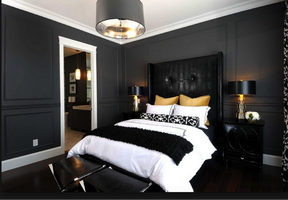
A lighter tone black walls, golden pillows, glossy black table lamp
|
Modern art piece as center focus of room, vertical trellis beam wall
Examine how natural light enhances a black/white space
|
Modern black pendant lamps and tables/chairs, motif black wall paper
|
Disclaimers: Please note that the pictures shown do not depict our own works. We are just excited and eager to share some nice homes based that fits in to our theme and under any situation did we receive any form of incentives from the owner's of the works.
References and bibliography:
1) http://denoxa.com/
2) http://ontrus.com/
3) http://www.luciehome.com/
4) http://thisforall.net/
References and bibliography:
1) http://denoxa.com/
2) http://ontrus.com/
3) http://www.luciehome.com/
4) http://thisforall.net/
IASPL top 5 picks for Nov 15 (Grey theme)
"GREY !! Come on, how can this be funky or exciting? It is a colour for convenience at best." - This is a common perception received from our fact finding.
Nonetheless, grey is the latest new neutral colour since 2014. It has recently taken the spotlight, upstaging it’s most neutral and common cousins; taupe, beige and ivory.
The neutrality of which is the core element why most designers like to work with this colour. We are intrigued to discover that different shades of grey allows easy manipulation between 'hot' and 'cold' neutral. Not sure whats hot or cold? (Imagine the feeling each gives you; Warm lighting 2700K or Daylight 6000-6500K)
This is the new must have essential colour that’s modern and edgy yet timeless and classic. Grey is becoming the ultimate neutral because it looks good with almost any colour. Classic Grey is a modern neutral that creates a light, airy feeling, yet adding more warmth to a room than basic white.
Grey has proven itself as the perfect backdrop ranging from classic to modern to contemporary.
Grey might make a room slightly dimmer or dark. One can place a mirror adjacent to the windows to maximise the inflow of natural light. This adds life and energy to a room!
Also, be sure to have more than one overhead light in your space, two sources or more will be suffice to light up your space. It is getting popular in Europe and Asia where many people enhance indoor lighting with sconces. Choosing a proportionately sized lamp and placing it well is key to good illumination.
This shadow coloured hue is a colour that really benefits from being well lit.
This month's article prepared by Ms Jane Sim - IASPL's Lighting consultant.


IASPL top 5 picks for Dec 15 (Blue theme)
By far the most popular colour group; blue is one of the most versatile colours that in its darkest hues is dramatic and the lightest tone being light-hearted / airy.
By creatively adding different mix of paint, we can achieve other hues to create stunning teals, turquoises, dusty bluish grays and more.
Blue is traditional and vintage in its darker tones. Contrasting it with hints of gold makes the whole environment posh and grand.
On the other end of the spectrum, we can easyily add white to a standard blue paint to achieve the different shades of light blue required. Light blue gives a breezy feeling and brighten up rooms. Lighter tones also have calming effects, thus it is perfect for a space to retreat and relax.
Of course, every home is different. With the selected lighting fixture and furnishings, it can affect the look of a paint colour. Here are some great examples for your consideration to start if you were thinking of adding a splash of blue hue to a wall or furniture piece.
This month's article prepared by Ms Jane Sim - IASPL's Lighting consultant.


